
css function
`superellipse()` CSS function
Limited availability
The superellipse() CSS function defines the curvature of an ellipse, and is used to specify corner shapes either directly, or via <corner-shape-value> keywords.
Syntax
superellipse(infinity)
superellipse(4)
superellipse(1.7)
superellipse(0)
superellipse(-2.8)
superellipse(-3)
superellipse(-infinity)
Parameters
<number>- : A number in the range of
-infinitytoinfinity, inclusive.
- : A number in the range of
Return value
A superellipse shape.
Description
The superellipse() function returns a superellipse shape, which is used to specify corner-shape values. A superellipse is a closed curve symmetric shape between a rectangle and an ellipse. It resembles an ellipse that retains the geometric features of its two axes.
The superellipse shape is calculated using a modified version of an ellipse. The following equation defines an ellipse centered at the origin:
The a and b variables refer to the radii of the ellipse, while the x and y coordinates are points on the ellipse’s circumference.
A circle is an ellipse where the radii, the a and b in the previous equation, are the same length. With a and b both equal to r, the equation for a circle can be written as:
In this equation, the x and y are coordinates of points on the circle’s circumference, and the r is the radius of the circle, with the center of the circle being (0, 0). The ellipse is produced by scaling a circle shape along the x and/or y axis.
A superellipse shape is created by replacing the 2 exponent in each case with 2K, K being the argument passed to the superellipse() function, which modifies the curvature of the ellipse:
The following diagram illustrates different superellipse() values for the top right corner of a container: infinity, 1, 0, -1, and -infinity:
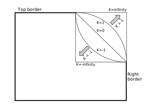
- A
Kvalue of0creates a straight line. This value can be used to create bevelled corners and corresponds to the<corner-shape-value>bevelkeyword. - A
Kvalue of1creates an ordinary ellipse, corresponding to theroundkeyword. - A
Kvalue of>1makes the ellipse shape more square;2corresponds to thesquirclekeyword. - A
Kvalue ofinfinitycreates a perfect square (corresponding to thesquarekeyword), althoughKvalues of10or more are virtually indistinguishable from a square. - Negative
Kvalues result in a concave curve, resulting in corner shapes that are curved inward, or “scooped out”. AKvalue of-1corresponds to thescoopkeyword and-infinitycorresponds to thenotchkeyword.
A negative or positive superellipse would appear symmetrical to a superellipse with its inverse value.
[!NOTE] For any
Kparameter value passed, thesuperellipse()function’s return value will always be the same for thatKvalue. When that value is applied to two elements, the appearance of the corner shape may differ if the box size orborder-radiusvalues differ.
Formal syntax
Examples
superellipse() value comparison
In this example, two <input type="range"> sliders allow you to cycle through many different corner-shape superellipse() values and border-radius values enabling you to compare the effects of each on a container. The code is hidden for brevity, but the full explanation of the superellipse value comparison is provided on the corner-shape reference page.
<form>
  <div>
    <label for="superellipse-slider">Choose a superellipse() value:</label>
    <input
      type="range"
      id="superellipse-slider"
      min="-5"
      value="0"
      max="5"
      step="0.1" />
  </div>
  <div>
    <label for="radius-slider">Choose a border-radius value:</label>
    <input type="range" id="radius-slider" min="0" value="45" max="90" />
  </div>
</form>
<section></section>
html {
  font-family: "Helvetica", "Arial", sans-serif;
}

body {
  width: fit-content;
  margin: 20px auto;
}

section {
  display: flex;
  justify-content: center;
  align-items: center;
  flex: 100%;
  margin-top: 20px;
}

form div {
  margin-top: 5px;
  display: flex;
}

section {
  width: 100%;
  height: 180px;
  background-color: orange;
  background-image: linear-gradient(
    to bottom,
    rgb(255 255 255 / 0),
    rgb(255 255 255 / 0.5)
  );
}

section {
  box-shadow: 1px 1px 3px gray;
}
const rectangle = document.querySelector("section");
const superEllipseRange = document.getElementById("superellipse-slider");
const borderRadiusRange = document.getElementById("radius-slider");

function setCorners() {
  const seValue = `superellipse(${superEllipseRange.value})`;
  rectangle.style.cornerShape = seValue;
  const brValue = `${borderRadiusRange.value}px`;
  rectangle.style.borderRadius = brValue;
  rectangle.innerHTML = `<div><code>corner-shape: ${seValue};</code><br><code>border-radius: ${brValue};</code></div>`;
}

superEllipseRange.addEventListener("input", setCorners);
borderRadiusRange.addEventListener("input", setCorners);
setCorners();
[!NOTE] See also the
<corner-shape-value>value comparison example.